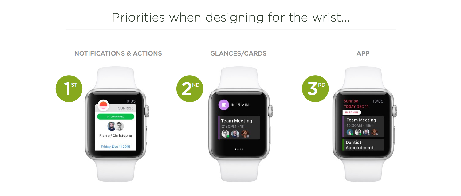
The vast majority of my interactions with the Apple Watch involve notifications. I get a light tap on my wrist, raise my arm, and get a bit of useful information. This awareness of what's happening helps me stay connected to the real World and is the primary reason I enjoy wearing a smartwatch.
Thanks to "long look" notifications, I'm also able to take action on some notifications —mostly to triage things quickly. Much more rarely do I engage with Glances and even less with apps. This creates a hierarchy of use: notifications, glances, apps.


No comments:
Post a Comment